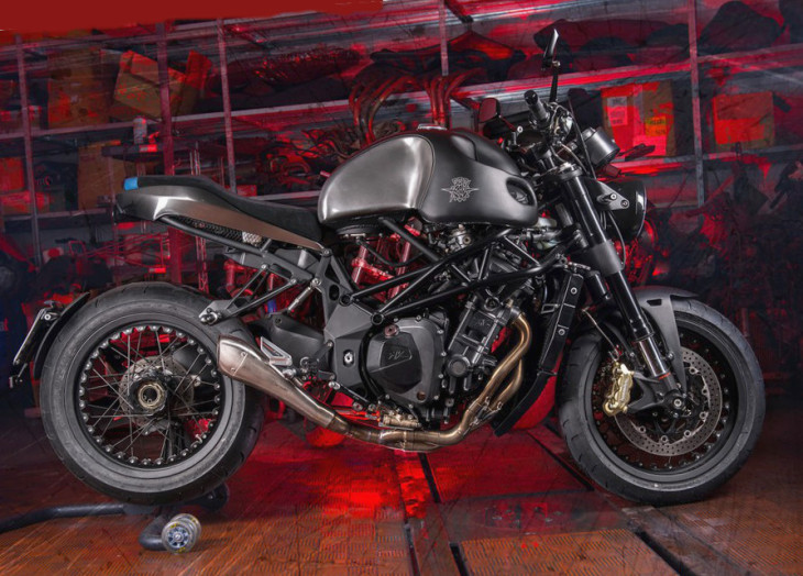
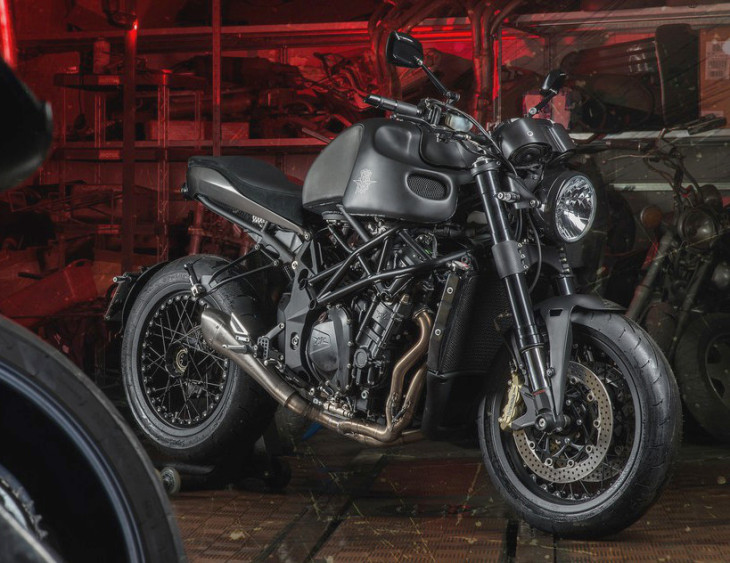
Officine GP Design is an Italian customizer well known for its elaborate conversions of production motorcycles. The Brutal Boss pictured here is based on the now discontinued four-cylinder MV Agusta Brutale 920.
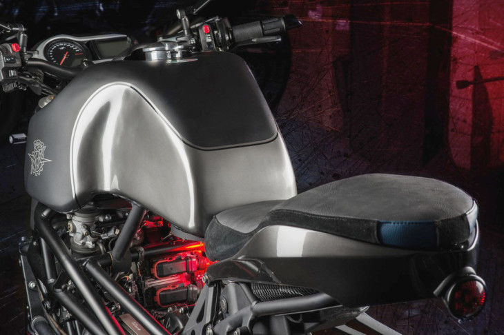
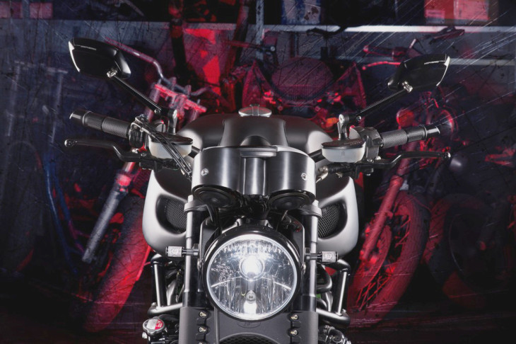
The Brutal Boss was prepared for a customer looking for a motorcycle inspired by the 70s. Stripped bare, a new tank made of aluminum was created by hand, along with the front fender, instrument covers and rear subframe. Additionally, the entire stock lighting system has been replaced, and the bike has been treated to Kineo spoked wheels.
Take a look at Officine GP Design’s web site to get a better flavor for this small Turin custimizer.


That is so ugly. I would withhold payment for services rendered for the design of this two-wheeled abomination. It’s a supposed to be a motorcycle, not a “Transformers” wet dream.
Expensive rat bike !
….massive fail…..
That’s a shoddy tank seam right there.
Also, even when I don’t like a design, I can generally find some “redeeming” part of that design to like. Not in this case. Even the angle of the bars….very strange angle, no?
“That’s a shoddy tank…” full stop.
Good point, Brinskee.
This whole thing is a mess.
yup!dung beetle..Brutale elater….got a ring to it…..Ugly!
Have you checked the cost of replacement MV Augusta parts lately?
It’s worth rehabilitating a crashed Brutale with recycled parts.
Ugly. Seat slides into the tank. I’ll take a Duc Scrambler, R Nine T, CB1100, CB1000R, BMW 1000R. – The view from the back of the tank though looks like it would be a fun ride though. Might be onto something there. A hideous bike might make some of us old geezers look a tad younger.
How can you guys say this is soooo ugly? Wait until you see a new BMW GS.
I keep thinking “dung beetle” whenever I look at it.
Looks like an alien giving birth.
…but it is true, beauty is in the eye of the beholder. What can I say – I ride a Buell – ha ha ha
Now THATS a NAKED BIKE
It will be good when it’s finished.
The designer should have looked at MV’s own Brutale 800 Dragster RR, and then discontinued this custom project.
WTF? It makes the custom Scout from Klock Werks look gorgeous ….. and that is also one very fugly motorcycle. In a nutshell, I DON’T LIKE IT. Merry Xmas
I wonder if Ichiban Moto had anything to do with this?
“Mr Max? Yes, your motorcycle is in.”
Steam Punk Designs?
Sad what fire can do to a bike.
Horrible, ugly, and 3 other words I can’t use here…
Oh my! I just puke in my mouth a little!!!
When I was a kid, I had a box of left over and broken plastic model pieces/parts. Every once in a while I would get bored and start gluing them together. That’s what this bike reminds me of.
As for the gas tank, with that much empty real estate why would you raise the center of gravity unless you did not care whatsoever about the handling of finished product?
What a mess……I guess “style” is subjective even in Italy.
It’s a Mad Max cool kinda ugly. And you can actually ride this bike somewhere, park it, and not have to worry as much about it getting stolen. Works for me!
I’ll go against the grain and say that I really think this is a cool bike. The only problem is that I know what it looked like before the build, and, cool though it may be, this is a bad sequel in comparison to the original masterpiece.
I’m right there with you. It’s pretty cool in a monster-ish sort of way but a step (or two) backwards from the Brutale.
Sorta cool but it looks like a bed pan under the tank with that tube hanging down. I do like the jock strap rear fender and there are lots of spots to connect bungee straps. My actuary wouldn’t allow me to buy this cuz we’d have to camp in Italy.
Tell Don that Italy isn’t such a bad place to camp.
He’s crazy enough to even camp at the office.
Must be the stress of being “The Mayor”.
Was it wrecked before the project?
The insurance must have totaled. But Dr. Frankenstein said they were wrong!
Looks like it was built in a garage
Brilliant. Take the most beautiful production motorcycle ever made and ugly it up like this. I hope they kept the original parts so they can rebuild it the way it was intended to look.
It looks like someone threw an Erector Set into a big pile and spray-painted the whole mess black.
Ugly for sure, but one-of-the-kind. And that’s why they made it.
I too would say that this is one-of-a-kind but more in the sense that every pile of steaming dung that comes out of the back end of a cow is one-of-a-kind.
Just sayin.
You could have used the snowflake analogy… never mind, you got it right.
Someone paid money for that? The fuel tank explains why even ugly women get married.
It probably has a great personality.
I think I saw this bike in one of the Mad Maxx movies. Ugly.
You know it might not be so painfully ugly if it had a panel to cover the gap under the tank, a real rear fender and some glossy paint in a nice bright color. See I could be a high priced desinger too.
I like it, but i’m not getting the 70s reference more 90s “rat fighter” than anything else.No chrome,little plastic, round headlight, no beak, what’s not to like?
It might be easier to not hate this so much, if they hadn’t used such a beautiful bike to begin with. When you know what it looked like coming off the assembly line, and see how they’ve mutilated it, it makes it impossible to be objective. It’s not unlike a plastic surgeon taking a beautiful actress and totally ruining her face. The designer should be imprisoned for what he’s done.
Start with a Horex next time, and I may be able to see some value in the changes.
I’ve never ridden a 920. I’m sure they are great bikes and I think the practical and beautiful 70’s UJM deserves a comeback inclusive and beyond the CB1100, but…. no.
The Seventies look meant disco dreck?
If I didn’t know better, the horrific expression of style would make me guess that “Officine” is Italian for Teutal Jr. (Check out that dude’s website if you think I’m off base).
I can’t think of one way this is an improvement over the original.
SURVEY SAYS…!
(*ding*)(board flip)
tank range… was the #1 answer.
looks Mil-spec… terminatorish. sorted with a “hyperalloy combat chassis”.
Jezuz…..I must be in the bizarro world or something- I LIKE IT!!!
Dirck note to self: “It’s OK not to post about the ugliest bikes in the world, even if they cost a lot of money.”
They didn’t even smooth the nutserts in the radiator.
Quite simply the ugliest bike I’ve ever seen . . . . . . . .
Good night, Brutal is right. That’s brutal to look at.
Guaranteed though, someone on here will think that’s the coolest bike they’ve ever seen.
Mikey you are correct…I am that guy, it is VERY cool and I like it! the Coolest…
Haha. Brutal to the eyeballs indeed.
But hey, someone’s gotta crawl down the trench and bump the uglies.
That made me laugh
The Doctor said “The Operation was a success, unfortunately the patient died.”
….looks like an agonizing death at that.
They took a Rembrandt and turned it into a …a …Tim Burton!
Indeed… Brutal.
But! what the __? Oh well! What was on my mind?