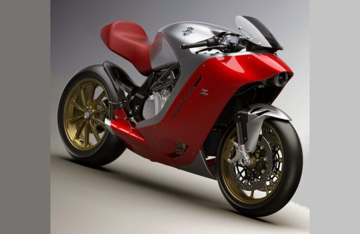
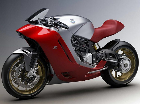
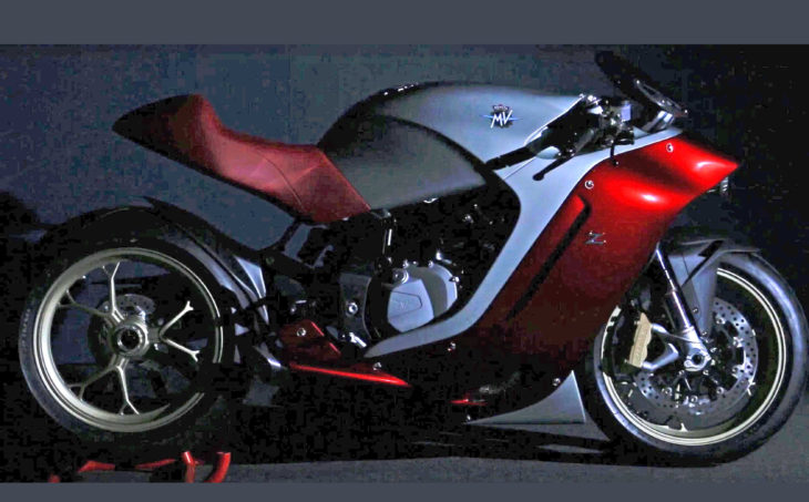
Although scheduled to be unveiled on September 4, for some unknown reason MV Agusta posted a clear photo of the F4Z on its Twitter account last night, followed by another angle on Instagram this morning. This is the design collaboration with Zagato that we told you about earlier. The photo above is the Twitter posting, the photo immediately below is from MV’s Instagram, and the photo at the bottom is the Photoshop-enhanced version of a teaser we posted last week.
We appreciate it when designers take chances, but we admit to being puzzled by the F4Z on a number of levels. This will be an extremely fast machine with the superbike engine and chassis from the MV Agusta F4, of course, but the ergonomics and wind protection (or lack thereof) don’t seem like a good fit with that power and speed. Those thoughts occur before we even get to the aesthetics.
In the end, “beauty is in the eye of the beholder”. Share your thoughts below.
See more of MD’s great photography:

Now that the headlight appears actually centered, overall it’s not that bad. I like the color scheme. Previous views with what appeared to be an eccentric headlight made the design look unbalanced and off-putting.
While its looks are somewhat “cutting edge” this design just isn’t classy enough for the MV brand nor the legacy of the brand (Ago) But that really looks like an ’80s concept bike from japan. (IMHO) can anyone say VFR1200?
It looks one step away from what a riderless bike might end up being
Beauty, Beauty, Beauty, subtle beauty….not to bogus, its actually sexy
Which is the front and which is the back?
Exactly what I thought
“beauty is in the eye of the beholder” – ahhhhhhhhhhhhhhhhhhhhhhhhhhhhhhhhhhh
My eyes are burnt
It didn’t work for Edsel in the late 50’s but why not try it again. vulva haven’t changed.
Looks they they took all the wrong styling cues from the Lotus motorcycle concept, which in my opinion was pretty damn gorgeous.
K1200GT fairings looked similar to this.Was that ugly too?
I like it. Futuristic, without jumping the shark. It actually is closer to how I imagined the bikes of today when I was a kid.
This thing is BUTT UGLY!!!
Needed a front view photo to see how much flow-through there is. And crosswinds’ effect? Brake, turn and tail lights will disrupt the clean lines.
The comments to this are awesome. Up to 122 currently and I am still amazed at how many different ways folks have come up with to say “abomination.”
I love you guys.
It looks better than the Transformer toy look that has taken over.
At first glance up close, it look ugly. But when I moved back 50 feet from my screen and refocused my eyes – it looked absolutely hideous. It looks like one of those eels that latches on to its victims with its sucker mouth. Other than that I like it. It makes my Buell look like a 1199 Ducati – that should tell you something. Excuse me – I gotta go find that bag I found on the airplane. Good luck with that.
From the handlebars back it’s good to go.
Wow! This looks fantastic. Cool. Only problem is, they will certainly be out of money (for the forth time?) before this ever makes it to production…..
VFR Katana
Wow, hope it looks better in person. There’s not been an MV Augusta I didn’t lust after at some level, but there’s a first time for everything. Hope this concept evolves, but there’s not much time to do so.
I think great styling happens when form and function are integrated in a way that doesn’t obscure the visual cue of the functional part’s purpose. In this design, the functional elements are reduced or fused to single part visual cues and that effectively renders it ugly.
George Jetson’s robot looks better. That seriously misses the mark!
My original vote was removed (I guess Dirck didn’t enjoy my comment) but for the record, I find this bike ugly. It has very strange proportions.
Did someone say Honda Pacific? I don’t know, the Italians often lead with designs that others copy (single-sided swing arms, under tail exhausts, flat black finishes, minimal decals) but this is a real pile.
The best comment I saw on FB about this thing was “it looks like the ugly love child of Shamu and Iron Man”. That about sums it up.
Agree with others saying this is reminiscent of Hans Muth’s Suzuki Katana – a radical styling skin on top of a relatively mundane and conventional chassis. Personally I think this is a good looking design that would be even better with hub centre / cantilever / hossack steering and electric power.
Finally manufactuers are building bikes that are beautiful again. I’m so done with the transformer razorblade clusterfuckery that has dominated for so long.
I’m liking it a lot. We have had enough retro to gag a moose, the anime look is erupting everywhere, and it seems everyone has an “around the world” bike in their model lineup to make going to work feel like something special. Here we have a very smooth outer shell, with a headlight peeking out the front and a hint of the complexities of the actual running gear at the rear of the bodywork.If all of the missing street legal equipment blend in when added, I think they have a potential game changer here. Or a turkey that no one will buy. Bravo MV! It takes a bit of moxie to try something new.
Striking. Art Deco locomotive springs to mind. I like it.
Response is overwhelmingly negative, but I have to say that I am quite intrigued by the design. So many elements of it break the mold, and I think I quite like it. It reminds me of the Ducati 999, a bike I didn’t like the look of at all initially but now holds a place in my mind as one of Ducati’s most attractive sport bikes.
The design of this MV makes me think. And the more I think about it, the more I appreciate it. The more I appreciate it, the more able I am to see the beauty in it.
Cool! Now there’s finally a way to make a Yamaha FZ-10(a bike I like a great deal, except for its styling) look bitchin’! You just park it next to one these beauties! I can’t believe that MV Augusta (the company that brought us the Brutale, maybe the prettiest thing on two wheels I’ve ever seen) is actually is actually going to make something this ugly. How sad.
So right !
Most everything they’ve done to this point is just beautiful.
This is so incongruous!
Is this merely someone’s styling exercise or will it be a production model?
I admire their bravery bur question their judgement. As others have mentioned I wonder what it will look like in final, street-legal form.
A select few will see it as a must have – perhaps that’s all that matters…
You look like a sport bike…you sound like a sport bike…but I’ve got eyes….
you’re a Dalek in disguise oh yes you are…a Dalek in disguise…
It has a well hidden headlight, which is unique to motorcycles. And it has no mirrors or blinkers, which renders it not street legal. Put those onto it and suddenly it won’t look quite so unusual. The latest Honda VFR has a few lines like this. I like it.
Reminds me of the ’82 Suzuki Katana, a quirky design, around for a couple of years and then gone. Looks like a styling exercise on this MV.
i believe the wind protection, for a shorter rider, will be fine. The gas tank will take care of the upper body coverage, leaving the upper front of the fairing/small screen to handle helmet duty. Back end is incomplete.
1 word, WONKY.
but then maybe that’s the point…? they say there’s no such thing as “bad publicity”, so if the goal is to put the name MV Agusta in the mouths and minds of the motorcycling public (if only for a brief moment) i’d say they’ve succeeded.
it has only two wheels. It’s A-OK.
Close, but not quite. Looks like it was designed by someone that likes to draw pictures of fast motorcycles, but has never actually ridden one.
Considering it was designed by a car guy, that could be a pretty accurate description!
It has Beautiful lines from the faring into into the tank, but what I think would look nice would be a larger more interesting upper faring that what looks like on this one, would turn with the bars. The first Ducati multi-Strada attempted this look as I think “stinkywheels” was alluding to, but fail pretty badly in my estimation. That does not mean it couldn’t be done beautifully.
It could also be a dealer or aftermarket add-on.
Further either a dramatically smaller round front headlight which they can do now with LEDs, or an interesting cat eye headlight centered by a small LED main light. Just my .02 worthless ₵’s…
Could this be the two wheeled version of Conan Obrien’s “If they made it?”
Looks a bit like the homely offspring of an early era small displacement scooter and a futuristic hover bike with great fit and finish.
Oops! It’s ” if they mated”
You get the idea
It looks super cool!
If I was given one, I’d take it. To buy, not quite. Did Pierre Terblanch get loose in their design studio?
Why is there never love for good ole Pierre? Many remain upset about his 999/749, both of which I think have proven to be forward-thinking designs that have been very influential – you can see the 749/999 influence in many current designs. On wikipedia there is a listing of his motorcycles, just looking at them shows how much of an artist he truly is:
Ducati 888
Cagiva600 Canyon
Cagiva 900 Gran Canyon
Ducati Multistrada
Ducati Hypermotard
Ducati Supermono
1999–2007 Ducati SuperSport
Ducati MH900e
Ducati 749/999
Ducati SportClassics
Moto Guzzi Concepts Eicma 2014
Confederate X132 Hellcat Speedster
The 888 and Supermono were exceptional in styling. Great looking both of them. First Gen Monster, yes. Everything thing else on this list, no. And when you go from a 916/996(one of the best looking sport bikes ever) to a 999, it is a big disappointment to say the least. Going from a 10 to a 6(being generous) cannot be rationalized.
Sorry man. Got no love for Pierre. I was going to post a joke involving a chipper. But I didn’t.
The only ones that aren’t aesthetically challenged were the 888 and Supermono and they weren’t clean sheet designs. Just my opinion though. The SS wasn’t too bad, nor the Sport Classic.
I love it as an avant garde styling exercise and would love to have one. I do think it would look better with twin headlights instead of the one eyed droid look. For some reason Zagato did not contact me for my opinion before finalizing the design.
Looks like they just copied the Suzuki Nuda Prototype. http://www.bikeexif.com/suzuki-nuda
YUP I just thought the same thing and then googled it and then looked in this comments to see if anyone else thought the same. +1
http://www.visordown.com/sites/default/files/1987-suzuki-nuda-com.jpg
Real bikes have rear fenders.
I guess if a person does not have anything good to say about this bike it is best to say nothing. Although, I do agree with Marc, it does make a KLR 650 look really good.
That’s funny! Brought to you by the designers of the Pontiac Aztek!
Has some nice lines on it, but it looks so…. bloated.
What’s it filled with? Donald Trump’s breath?
Hillary Clintons honesty and morals
But that would have made it skinny, because she doesn’t have any.
You can’t hardly go anywhere without hearing about the US presidential elections and all the endless negative comments surrounding it. Do you think it would be possible to leave that crap out of this blog and confine your remarks to the subject at hand.
I think the styling is very interesting. Has a 1930’s alternate reality look to it. At least there is some artistry here instead of the “Michael Bay Decepticon” inspired lines we have been seeing as of late.
like the look. doesn’t look too comfortable; but, I’m not a speed demon either.
I have to tend to the “abomination” side. From some angles it looks like some sort of fish. Maybe it’ll grow on me, but I’m doubtful.
Just as soon as it laps quicker than other bikes in this cc of displacement!At that point it may become popular?As it is for my own tastes?I prefer the RC 30,RC 45,RC 51,RG 500 streetbike,RZ/RD/RZV 500,NS 400R,and a whole bunch of stuff that is better looking and probably quicker too?HM
Love the color and wheels. But I would take an RC30!
No run of the mill bike. It’s interesting and nice looking. You won’t see many on the street, but when you do it will stand out from the crowded field of look-a-likes and make a powerful and positive impression.
Need more bikes styled like this one! They will make my KLR and Versys look good… or at least not as ugly.
It’s interesting, but I’d prefer a bike with a more natural beauty that requires no explanation. If you have to explain it, you’ve already lost some of the joy of motorcycling.
Ah, the sound of one hand clapping…
I still say that it looks like a Honda vfr1200. With a better muffler, and worse headlight. Is it beautiful? Yes, in a museum quality but impractical to ride way.
ABQ, I’ve got a VFR1200F in my garage, and the only similarity is the red and sliver tins of paint used here.
This bike does not look like a VFR.
It looks like a Show Special by a Design Student for their end of year assignment.
Proof yet again that you shouldn’t let car guys design your motorcycle. You’d think they would have learned that lesson after the Ducati 860GT and first version Morbidelli V8. 😉
It is really beautyfull, I owned one small MV Agusta l50 CC Sport bike in I962 and traveled from Kuala Lumpur to and fro Singapore. I really enjoyed the ride.It really come back to Live.
Somehow it manages to look like it has two back ends
It is not going to be with a girl.
Hopefully the Kymco clone will cost less.
“Starship Troopers”
The headlight reminds me of Bill the Cat from the old comic strip Bloom County. Other than that it looks like a manatee. Zagato was overpaid.
May be better in person, but here… nope.
http://i.telegraph.co.uk/multimedia/archive/01638/mick2_1638039c.jpg
Beautiful! We live in the best of times! Thanks to motorcycledaily for keeping us informed.
I love it
Yep, this^^
I love it
For me it’s clear: an ABOMINATION
Cracks me up when folks use the words practical and aerodynamic when talking about motorcycles.
So I guess in your mind a MC should never have to be practical transportation? A MC is nothing but a toy to you? I and others use them for long distances on occasions w/many containers of items if needed.
I ride my ’97 Monster the 82 miles to work and back 5 days a week as long as the temp. is above 50, rain or shine. Is it practical? hell no. Do I love it? hell yeah. Yes it’s a toy.
I see…..so you are into high maintenance toys. To each their own happiness. 8^ )
Interesting, think it will look even better over time, like the 999, or the Katana.
Looks like something that Hans Muth would pen if he did something for Suzuki again.
https://upload.wikimedia.org/wikipedia/commons/2/20/Suzukikatana1100-2010.JPG
needs more cow bell, again i’ll just leave this here…
http://www.waltsiegl.com/portfolio/nicholas-bol-dor/
Agreed.
They had super-duper English designer, who they showed off lavishly. Did they dive him boot? This is snail without shack. A hoodlum.
This is confusing. Seeing the black GPZ900 on screen with this thing makes the Kawi look like a cobbled together farm implement. But I love the look of the Kawi, and see nothing to like in the fairing, tank & seat of this thing. Weird. Are you messing with us, Dirck?
if I take my thumb and cover up the ‘windshield’ and the headlight, the body geometry and fairing style looks intriguing. If I don’t, then the proportions just looks all off and the lines don’t work together… somehow. However, I’d much rather own one of these than the abomination the Kawasaki H2 is, some maybe go back to the drawing board and try again?
Someone’s BFA project?
I like it. It’s polarizing like the original Katana was. A beauty to my eyes.
I picked the wrong week to stop sniffing glue.
Needs whitewall tires…
Hand me a bucket.
Looks like an espresso maker
It’s like a butterface but more like buttereverything
The shape doesn’t flow at all. The seat design and color are ugly, and the front looks like a disproportionate-sized air shovel – I can’t imagine that it has a low drag coefficient. Other than that it’s a striking looking bike but way below par for MV Agusta.
Maybe the looks will grow on me but I doubt it, I fancy designs that look like they slice through the air
This is a company that is on bankruptcy and they come with this thing. You think they will be more cautious on what they do with little cash they have…
With this looks it will be better electric bike.
Don’t look at me! I’m hideous
“What happened to your face, it looks like an old catcher’s mit!”
https://www.youtube.com/watch?v=MCFvZLjRPNg
If beauty or abomination are my choices, I’ll take the latter.
Kind of a Tupperware street fighter with an anything but graceful tail section.
I’d lessen the everything visually forward, make a trellis subframe to match the trellis part of the frame, that casting on the frame could go too, then make the seat the same shape as the red part of the plastic.
I still probably wouldn’t like it. But I wouldn’t like it a whole lot less.
This is why fat chicks get laid, someone thinks they are skinny.
Needs the front end of a Bimota Tesi.
What might the buyer profile be like for one of these machines?
Visually impaired.
Rich, bored bike collector
lacking in Moto IQ.
It looks like that one eyed thing that pokes his nose out of the sheets every morning, so I guess I kind of like it.
What kind of industrial accident were you (or, possibly, your partner) in?
It’s a thing of beauty… compared to a Confederate Wraith. For some reason, it also brings the old Honda Pacific Coasts to mind.
Gads! Look away!
Never been a fan of bodywork “seemlessly” blending into the tank. Did not care for the original Honda 600 Hurricane for the same reason. JMHO.
A prime example of why automobile designers should never design motorcycles. Hideous.
No practicality whatsoever. For looks only as in on display. Where’s the muffler?
Sorry guys, but have you seen how motorcycles look these days? The Yamaha FZ10 would be fine for Transformers, but to see every morning? Kawasaki has lost it completely. RSV4s are incredible, but ugly. This MV really isn’t all that bad.
You mean you don’t think my new KLR is beautiful?
Looks very cool. Very unusual, but elegant. Function…..eh….wouldn’t want to be sitting in the wind at the speed that it’s capable of….but the throttle control is variable.
Build around the rims and windscreen. Trash the rest. CHEERS!
Nice, clean design. It’ll be interesting to see how it performs in real world testing.
MV needs to kill that design. Kill it with fire.
I vote abomination
Looks like a WW2 German rocket plane
Reminds me of the Lotus motorcycle shown a year or so ago.
Chris
1996 called and wants its concept bike back. Reminiscent of the Suzuki Recursion, but not as well done.
The GPZ looks better.
And a plank seat too. Really though it’s beautifully turned out and different as a concept bike should be. Can we really be sure how bad the aero and ergos are until someone rides it?
Massimo Tamburini is rolling over in his grave.
More like throwing up in his grave…
I wouldn’t park my 748R next to that abomination if you offered to pay the service bill on my bike for the next 10 years.
Dam that new MV is fugly!
Needs Firestones.