David Ballinger must qualify as a modern Renaissance man. From house boats to furniture to modular cabins and custom motorcycles, whatever Ballinger dreams he seems to create.
MetroMotorbike is Ballinger’s motorcycle company, which creates truly unique machines with BMW Boxer twins and Ducati front ends, among various other parts. The look is unique, and the riding experience is likely unique as well, although we haven’t had the pleasure. Follow the link above to check out more details, but here is Ballinger’s bio from the web site:
British-born Ballinger grew up just north of London, England, with a British celebrity drumming father and Washington, DC, raised mother who were avid art/antique collectors. At an early age Ballinger would use his father’s camera to take random photos of buildings and landscapes. Not considering photography to be a ‘safe’ career he headed to the University of Westminster to study business and joined Harley-Davidson in Chelsea, London, in 1996. In 1998 he was part of the Harley-Davidson team that helped put together The Art of the Harley exhibition at London’s Barbican Centre. The exhibition morphed into The Art of the Motorcycle and went on to the Guggenheim Museum in New York City.
Artist / Designer David Ballinger is famous for his architectural designs, MetroSHED (a flat pack prefab freestanding room that revolutionized the garden shed into modern architecture) and the MetroSHIP (a houseboat with New York loft style interior which was featured as Neiman Marcus’ 50th Anniversary His & Hers gift in their 2010 Christmas catalog. The design inspiration for many of Ballinger’s designs comes from his architectural photography… the detail of a window, the lines of a roof or the use of non-traditional material to create a more liveable structure.
Ballinger’s work has been featured in Architectural Digest, The Washington Post, USA Today, Miami Herald, The Sunday Times, The Evening Standard, The Independent, NBC’s Today Show, MSNBC, CNN, ABC, Fox, CBS among others. Ballinger has designed Harley-Davidson’s for Chelsea Football Club and Kenwood Audio and is now working on a range of custom BMW motorcycles. His MetroSofa ‘green-built’ furniture can be seen in many boutique hotels, restaurants and bars in New York City, Washington, DC, Chicago, Los Angeles and beyond. He has sold art to Jeff Koons, Damien Hirst, Paramount Pictures, Sony, The Gap and numerous private collectors. Today Ballinger uses Leica cameras to create his art in tribute to photojournalist Henri Cartier-Bresson.
Ballinger’s claim to fame: Prior to moving to America, David was a drummer in a British band called Custom Blue, who’s music can be heard in Luc Besson’s,The Transporter movie.
Ballinger lives and works in a lakeside log cabin 35 minutes from New York City.
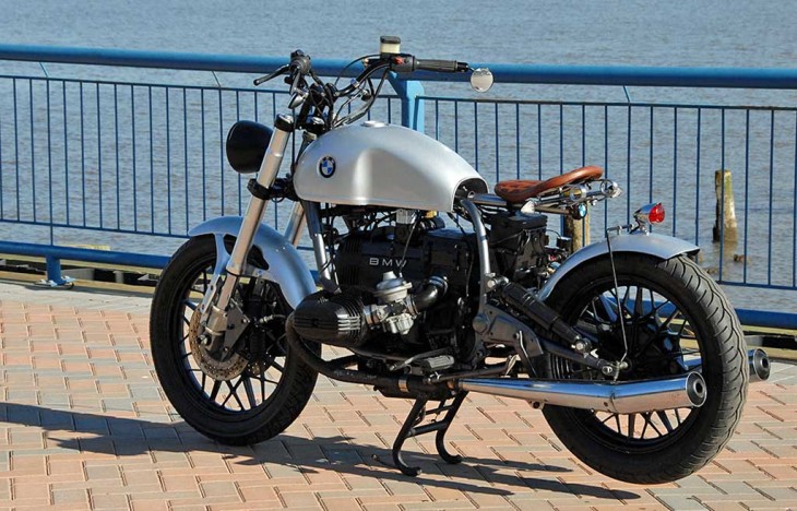
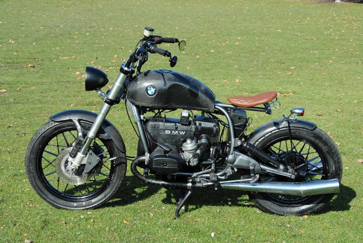

meh… stick to designing furniture.
Its hard to find words about these two bikes. Instead of going about five different diredctions, he should have just gone for almost a mini-chopper look (similar to a bobber but slightly different). What he did is definitely unique but thats about it, should have just gone with a hardtail and lowered the seat while using a true springer seat. Get rid of the mirrors and go for drag bars. Send the rear brake light back to where it came from and maybe try to put a wider rear tire to give it a chopper look. I know choppers are a dying breed and everyone needs a break from them but I think a mini “bmw” chopper probably hasnt been done and he could actually have made it flow better if he went in that direction. Just throwing ideas out there because I think he needs help.
I would not hit my dog in the butt with that thing.
These are what I called Frankenbikes, I can only see a pile of parts bolted together with no rythm or ryme….and probably too expensive where I can buy a motoguzzy V7 cafe or a Triumph Truxton off the shelve and much better looking.
I like all kinds of bikes, but anyone willing to part with their money for one of these is a fool and proves they have more money than brains.
I’m afraid I have to pile on with the haters. This is among the dumbest motorcycles I’ver ever seen. Sloppy, uncoordinated and horribly engineering come to mind. The only positive thing I can say is I think the is an early Moto Guzzi V11 Sport front end, very pretty fender.
The angle of the rear shock strongly indicates this bike was never intended to be ridden. I can’t imagine the spring rate you’d need at that angle, I doubt the shock will compress an inch over the full range of rear suspension travel.
Don’t worry Mr. Ballinger, everybody has a bad idea now and then.
Goose
Like somebody said, it does have a sort of Rat Bike charm to it. Thing is, rat bikes get their charm because they’re one-offs. Built, not bought.
I wouldn’t mind running it down a dirt road, but I can pretty safely say I wouldn’t spend any of my coin on it.
I think that everyone should own a torch.
When I look at these “creations” I think back to 1970s choppers. Not many people like those bikes now. But a restored or original bike is still a thing of beauty.
That O T Lump just doesn’t do it for me…Stock Classics BMWs from the 1960’s I prefer much better.
I like naked bikes, cafes, the occasional bobber, etc. However, I cannot decide what my reaction to this (the silver/white one) bike is. It is “interesting” on some level, as many custom bikes are, but as I look from one part of the bike to another, I am alternately interested and repulsed. If i could change just one thing on it, i would ditch the bars, they just look silly, or out of proportion. Or something. The lay down shock, battery in the breeze, and untidy wiring also could use some attention.
WTF?!
I guess I’m the only one who likes them 🙂
I am normally a fan of art bikes. But these have the aesthetics of “Junkyard Wars.” They’re not doing it for me.
Goofy-looking just for the sake of being goofy-looking. This guy is totally out of ideas…at least good ideas. Reminds me of the Woody Allen movie where a bunch of pretentious idiots are in an art gallery looking at modern art displays. They come to a display which consists only of a toilet seat hanging on the wall…and they all start oohing and aahing over it, because they want to show how hip they are to new things. People who say they like this thing, are those same people…
Okay, the first one is kinda pretty and nice, but the second one is not only a rip off of the first, but a really ugly one. I guess the renaissance man ran out of originality on his second project. How much for the advertorial?
I think I just threw up in my mouth a little bit.
I’m glad I saw this. I was thinking of doing something real similar with an early GSXR frame but I think I’ll change my mind. I don’t like the “chopped off” look of the rear subframe. I still may do a bobber but with a solo seat and a full fender. Or maybe I was right with my first thought and go the with cafe racer look.
Sometimes the box is there for a good reason. And sometimes a pile of parts that came from different bikes is a pile of parts that don’t belong on the same bike.
And this is the worst application of the overused Benelli tank I’ve seen yet.
agreed
Beauty is definitely in the eye of the beholder. That being said, the top bikes bars are WAY too high and the other bike isn’t very pretty.
I was out for a ride yesterday and spotted something I hadn’t seen before:a guy had made a bobber out of a Honda CX/GL 650/500. Had to do a double take to really notice it. Don’t see that often.
A stock BMW is much more beautiful and functional.
The front end seems too long for the bike, giving it a bit of a rakish stance, and probably impairing the handling. The bike actually looks better on its centerstand, which eliminates the raked look by raising the rear end.
Dirck,
Don’t let ’em knock ya down… there are millions of bobber/cafe style lovers out here. These two bikes look just fine to us. Even if the man chopped an antique BMW, I don’t care. I like ’em.
OK. Maybe not millions… just a few hundred thousand…
A pile of dung, by any other name, is still a piles of dung (two in this case).
As a big fan of bobbers, BMWs and Ducatis, I must say that these bikes are the worst of all conceivable worlds. I’ve seen some nice customs made using boxer motors, but these don’t come close. In this case the Emperor is naked a a jaybird, and we all can see it. It’s a shame that MD is actually buying into this mess.
You can keep your modern bikes with all that extraneous, non-functional plastic hung all over them. Bobbers rule. They always have.
I agree bobbers always will be classics. The problem lately is everyone is trying to “bob” every make of bike out there. Doesn’t work, this looks like a halfa$$ backyard mechanic went nuts with a hack saw. This thing doesn’t flow at all together
At least he could have painted the brake fluid reservoir black.
Not interested. All this nostalgia “bob this, cafe that”…whatever. Let’s talk about the new breed of adventure touring bikes and how they do it all. It seems the manufacturers are finally hearing the customer’s need for practical bikes that also have horsepower.
“He lives in a cabin 35 miles from New”. Maybe he got bored from reading Architectural Digest and decided to throw a bike together from parts lying around the cabin! You have to admit, it is unique in a ratbike sort of way.
Not my cup of tea either, but it is quite tidy, except for the front brake.
Come on.. Thats just plain stupid..
I dunno. When I look at the photos all I can think is “Is synthetic oil better then dino oil?” Maybe I’m jaded.
Well, they do deal with a couple of my pet peeves about bobbers, no fenders and no mufflers. But the rear fenders as they are will paint a road slime stripe up your back the first puddle you splash through. These bikes look like they might actually be OK to ride but they look pretty silly. And hey, can we get some relief from the Monkey Wards-Benelli Mojave fuel tanks on every other cafe racer “Build”? It’s a nice shape but it’s been done to death.
Worst rear shock placement – ever.
Yawn… I am looking forward to the bobber phase to end.
P.P.S. The master cylinder (dixie cup) is wrong too.
Oh for crying out loud the entire thing is a mess.
P.S. That tail light is just stupid.
I’ve often wondered if there is anyway to make a BMW boxer twin look cool. I think not. And I own one. I seriously doubt that it can be done due to the pure “engineering” nature of the beast. You can’t get rid of stuff or add chrome (even BMW failed at that) without making things worse. Airheads stood a chance, but all attempts failed. Oilheads are hopeless, even Roland Sands or Jessie James, or whoever, would never attempt it.
But then again I would like to be wrong. Being wrong is what I do best.
Where’s the rest of it?